Timeless Interior Design: Are Colorful Kitchen Cabinets a Passing Trend or Here to Stay?
Scroll through any design platform today and you’ll quickly notice a shift: kitchens are no longer just white. Deep greens, moody blues, warm taupes—even blush and terracotta—are taking center stage. For homeowners investing in a long-term renovation, this raises an important question: how do these bold choices align with timeless interior design?
As an interior architect, I often guide clients through this exact dilemma. The kitchen is not only one of the most visible spaces in a home—it’s also one of the most permanent. And while colorful cabinetry can be striking and personal, the decision to incorporate it requires more than just following a trend. It requires a deeper understanding of how a space will live, function, and feel over time.
In this post, I’ll walk you through the pros and cons of colorful kitchen cabinets—and, more importantly, how to think about them through the lens of longevity and real life.
What “Timeless Interior Design” Really Means
There’s a common misconception that timeless interiors are neutral, predictable, or even a bit safe. In reality, timeless interior design has very little to do with playing it safe—and everything to do with creating spaces that reflect their owner.
A timeless kitchen is grounded in proportion, material integrity, and thoughtful restraint. It doesn’t chase trends, but it doesn’t ignore personality either. Instead, it balances the two in a way that feels natural not just today, but years from now.
Achieving this balance requires architectural knowledge and discipline in designing. It’s not simply about choosing what looks good in the moment—it’s about understanding how each decision contributes to the overall longevity of the space. This is where professional guidance becomes essential, particularly in high-investment areas like kitchens.
The Rise of Colorful Kitchen Cabinets
For years, white kitchens dominated the design landscape. They felt clean, versatile, and broadly appealing. But over time, many homeowners began to crave something more personal—something with depth and individuality.
Enter colorful cabinetry.
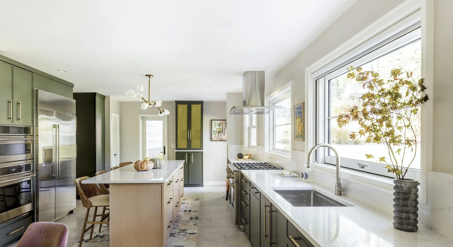
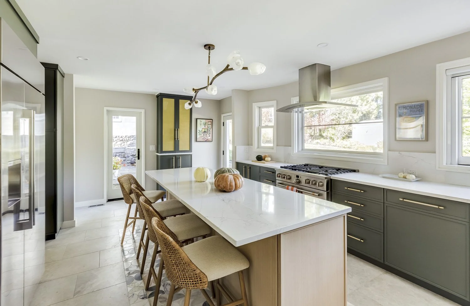
Today, we’re seeing a wide range of tones: muted olive greens, rich navy blues, warm mushroom hues, and even softer, more unexpected colors like dusty rose. Much of this influence comes from European kitchens, where color has long been used in a more understated, integrated way.
Social media has also played a role. A beautifully styled kitchen in a bold color can be incredibly compelling in a photograph. And that visual impact is often what draws homeowners in.
But what photographs well doesn’t always translate seamlessly into everyday life.
The Pros of Colorful Kitchen Cabinets
1. Adds Personality and Depth
Color immediately introduces character. A thoughtfully chosen cabinet color can make a kitchen feel curated and intentional, rather than generic or builder-grade. For homeowners who want their space to reflect their identity, this can be a powerful design tool.
2. Elevates the Overall Design
When done well, colorful cabinetry can read as more custom and high-end. It creates visual interest and can act as a focal point within the space—particularly in open-plan homes where the kitchen is always in view.
3. Creates a Warmer, More Lived-In Feel
Compared to all-white kitchens, which can sometimes feel stark, color brings warmth. This is especially appealing for family homes, where the kitchen serves as a central gathering space.
4. Works Beautifully in the Right Architectural Context
Color is particularly effective when it aligns with the architecture of the home. In historic or transitional spaces, for example, a muted, complex cabinet color can feel entirely appropriate—almost as if it has always been there.
The key is that the color feels inherent to the space, not applied as an afterthought.
The Cons of Colorful Kitchen Cabinets
1. Risk of Dating the Kitchen
Not all colors age equally. Some tones are closely tied to a specific moment in design, which can make a kitchen feel outdated sooner than expected.
Because kitchens are long-term investments, this is not a minor consideration. What feels fresh today may not feel the same in ten years.
2. Harder to Commit to Over Time
A kitchen renovation is not something most homeowners want to revisit every few years. While bold cabinetry can feel exciting initially, it can also lead to fatigue over time—especially if the color is highly specific.
This is where a more disciplined approach to selection becomes critical.
3. The “Real Life vs. Styled Life” Disconnect
This is a point that is rarely discussed, but incredibly important.
Kitchens are not just visual spaces—they are functional, sensory environments where real life happens. Cooking is not a perfectly styled moment. It involves raw ingredients, changing textures, and sometimes, less-than-beautiful visuals.
So it’s worth asking a simple question: How does a steak look in a pink kitchen?
In certain color environments—particularly those with strong warm or pink undertones—food can take on an unnatural appearance. Raw meat, for example, may look more intense or less appealing under those conditions. The same can apply to vegetables, sauces, and everyday meal preparation.
This doesn’t mean color should be avoided entirely. But it does highlight an important distinction: a kitchen that looks beautiful in a photograph may feel very different when you’re actually using it.
This is the kind of consideration that separates thoughtful, professional design from trend-driven decisions.
How to Use Color Without Compromising Timeless Interior Design
Color can absolutely have a place in a timeless kitchen—it simply needs to be used with intention.
1. If You Want To Go Bold, Choose a Color You Truly Love
In my experience, even the most unexpected color will stand the test of time, if it truly reflects you. I help my clients find the perfect hue of their favorite color, place it strategically and integrate it in the overall design.
2. Alternatively, Choose Muted, Complex Colors
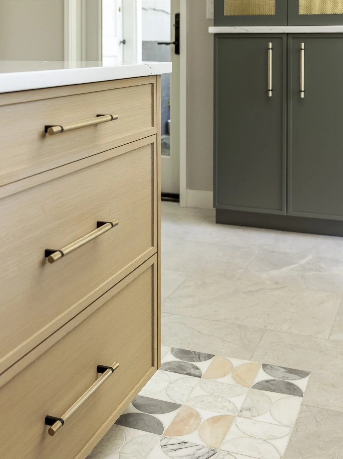
Instead of highly saturated or trendy hues, lean toward colors with depth and subtlety. These tend to age more gracefully and integrate more naturally into the overall design.
3. Use Color Strategically
Not every cabinet needs to be colorful. In many cases, restraint creates a more balanced result.
Consider:
A painted island paired with neutral perimeter cabinetry
Color on lower cabinets only
Using color in a secondary space like a pantry or bar area
Consider a colorful backsplash rather than your cabinetry. This can be more easily replaced should your change your mind
This allows for personality without overwhelming the space.
4. Pair with Timeless Materials
Color works best when grounded by materials that have proven longevity. Natural stone, wood tones, and classic finishes provide a stabilizing effect that keeps the design from feeling fleeting.
5. Consider the Architecture of the Home
A successful kitchen always feels connected to its surroundings. The cabinet color should relate to the home’s architecture, not compete with it.
6. Balance Aesthetics with Daily Experience
Beyond how a kitchen looks, consider how it feels to use every day. Lighting, food preparation, and overall visual comfort all play a role in how successful the space will be long-term.
This is where thoughtful design decisions make the greatest impact.
When I Recommend Colorful Cabinets to Clients
Colorful cabinetry is not inherently right or wrong—it depends on the client.
I tend to recommend it for homeowners who are:
Confident in their preferences
Planning to stay in their home for many years
In these cases, color can be a meaningful expression of personal style.
However, I advise more restraint when a client is uncertain or concerned about long-term flexibility. Not every bold choice leads to a better outcome, and part of my role is to guide clients toward decisions they will feel good about for years to come.
Ultimately, my approach is rooted in designing for how people actually live—not just how a space will photograph.
When to Stick with Neutral Cabinets
There are many situations where neutral cabinetry is the stronger choice.
In open-concept homes, for example, the kitchen is constantly visible and needs to relate seamlessly to adjacent spaces. In these cases, a more understated palette often provides greater cohesion.
Neutrals also offer flexibility. They allow other elements—art, furnishings, lighting—to evolve over time without requiring a full renovation.
And importantly, neutral does not mean boring. When layered correctly, neutral colors can feel incredibly rich, warm, and sophisticated. In fact, this level of restraint often signals a quieter kind of confidence—one that aligns closely with the principles of Timeless Interior Design.
Final Thoughts: Finding the Balance Between Trend and Timelessness
The question isn’t whether colorful kitchen cabinets are “in” or “out.” It’s whether they are right for the user and being used thoughtfully.
Color, when applied with intention, can absolutely contribute to a lasting, beautiful kitchen. But when driven purely by trend, it risks compromising the longevity of the space.
Timeless interior design is not about avoiding personality—it’s about making decisions that continue to feel right long after the initial excitement has passed.
The most successful kitchens are those that balance personal expression with elegance, visual impact with everyday livability, and current inspiration with authenticity.
Ready to Design a Kitchen That Lasts?
If you’re planning a kitchen renovation and want to ensure your decisions feel just as right years from now as they do today, I’d love to help.
At Lemon Grass Interior Architecture, I work with homeowners to create highly personalized, thoughtfully designed spaces that balance beauty, function, and longevity.
You can learn more about my services or get in touch through the contact page here.
To learn more about our services or to begin a conversation about your project, please visit our contact page. We look forward to helping you create a home that is as functional as it is beautiful.